Arrow
Arrow
Branding, UI/UX design, Illustrations, Motion
Branding, UI/UX design, Illustrations, Motion
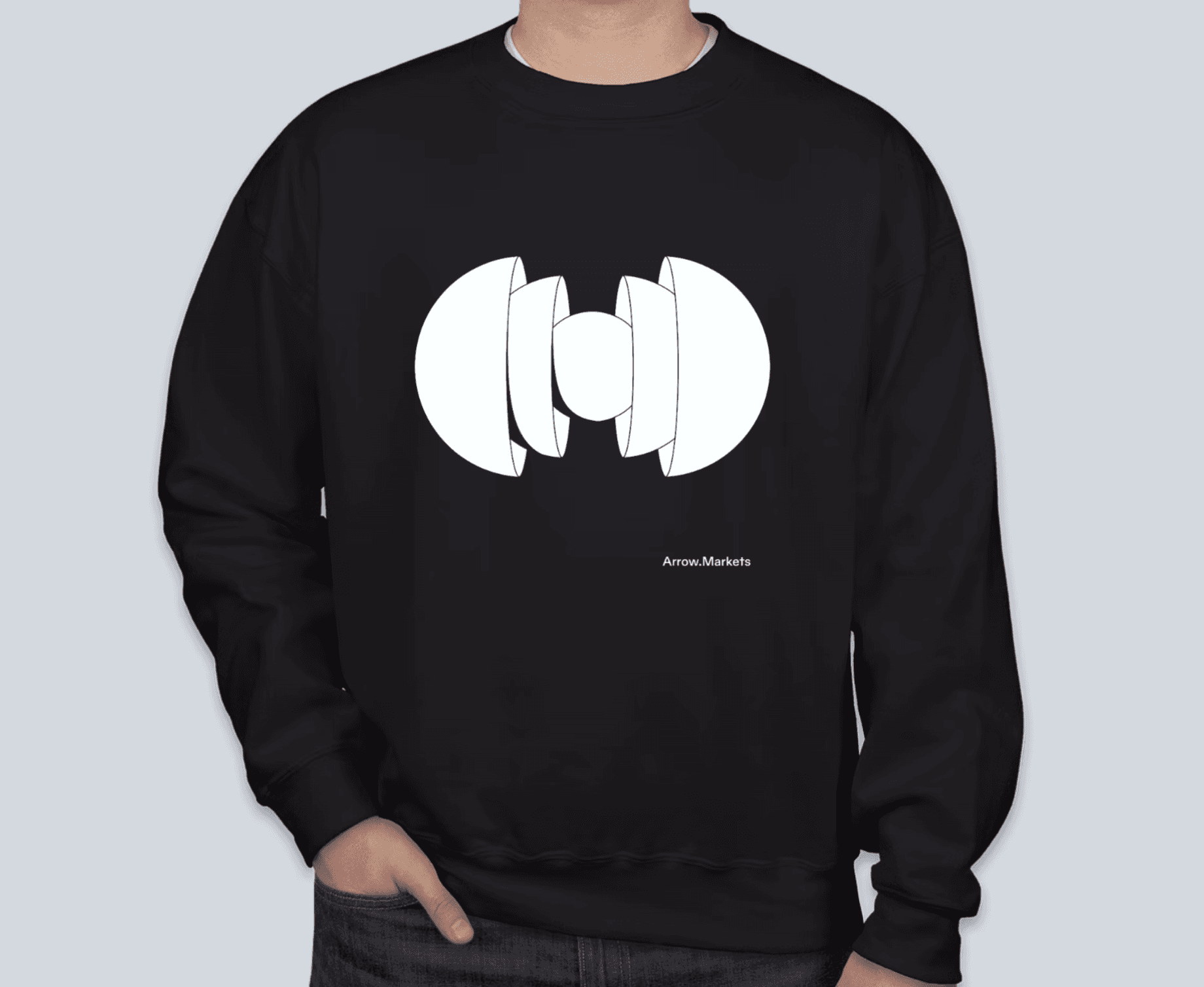
Arrow Markets is a decentralized options trading platform focused on speed, safety and transparency. The design goal was to move away from typical crypto aesthetics: cold, cluttered, overly technical. Instead, the identity aimed to feel elegant, spacious and intuitive. The final design centered on a minimal black-and-white palette, with isometric shapes like spheres, cubes and cones floating in empty space. These elements reflected themes of balance, structure and liquidity.
I was responsible for Arrow’s visual identity, from logo and illustrations to motion and UI direction. I worked with another designer to build a flexible system that connects branding and product.
Visual direction
Visual direction
Visual direction
The visual identity was built around three core principles: minimalism for speed and clarity, geometric structure for scalability, and visual hierarchy to guide users through complex information.
The water motif expressed both the liquidity of the platform and the sense of protection it offers traders. The identity extended into a flexible illustration and motion system that stayed consistent across product, website and social media.


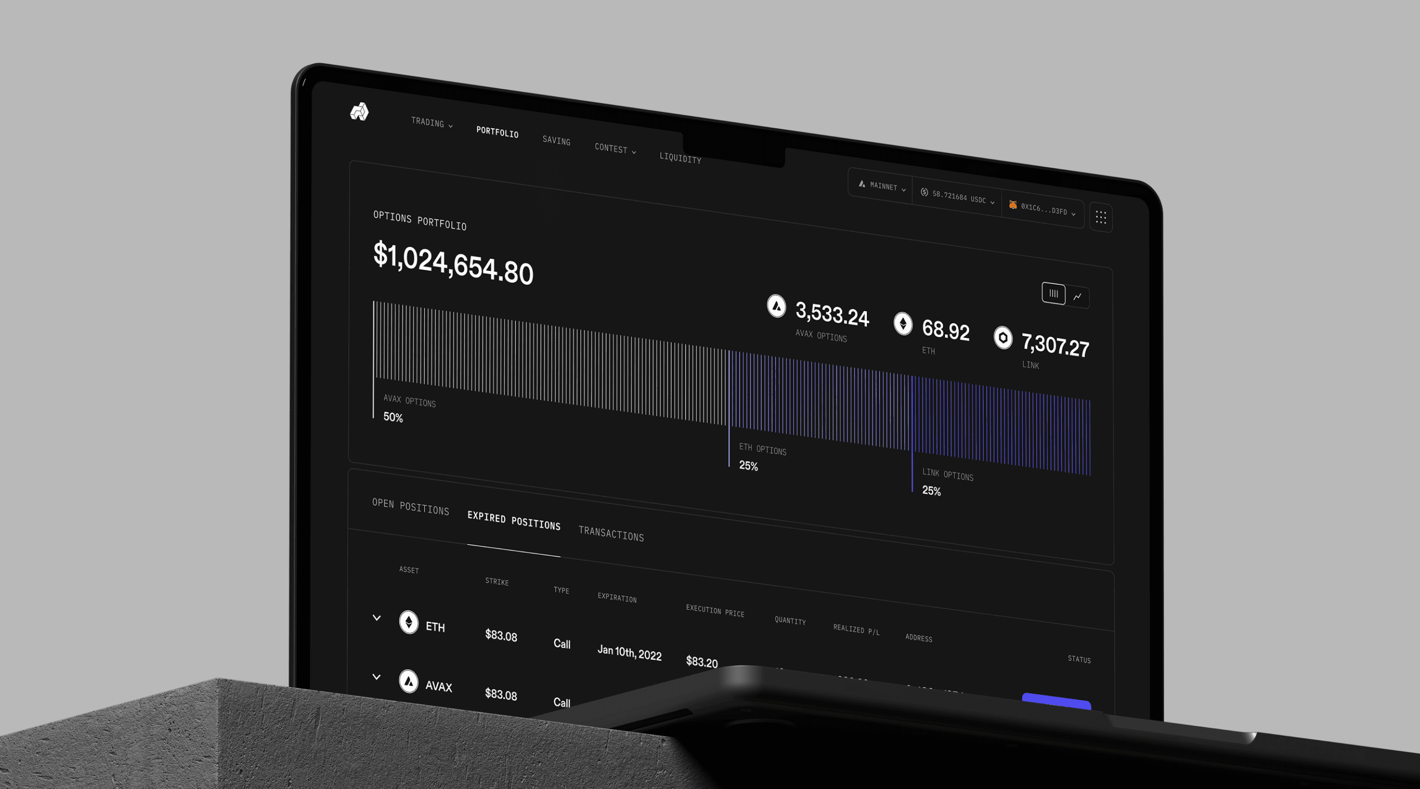
Trading application
Trading application
Trading application
These principles carried over into product design. The interface needed to support high-frequency trading of digital options without overwhelming the user.
A clean, minimal layout reduced noise and improved data legibility. Isometric tokens, structured dashboards and bold hierarchy helped direct attention where it was needed. Despite the volume of data and charts, the interface remained lightweight and intuitive thanks to a focus on essential content and restrained styling.


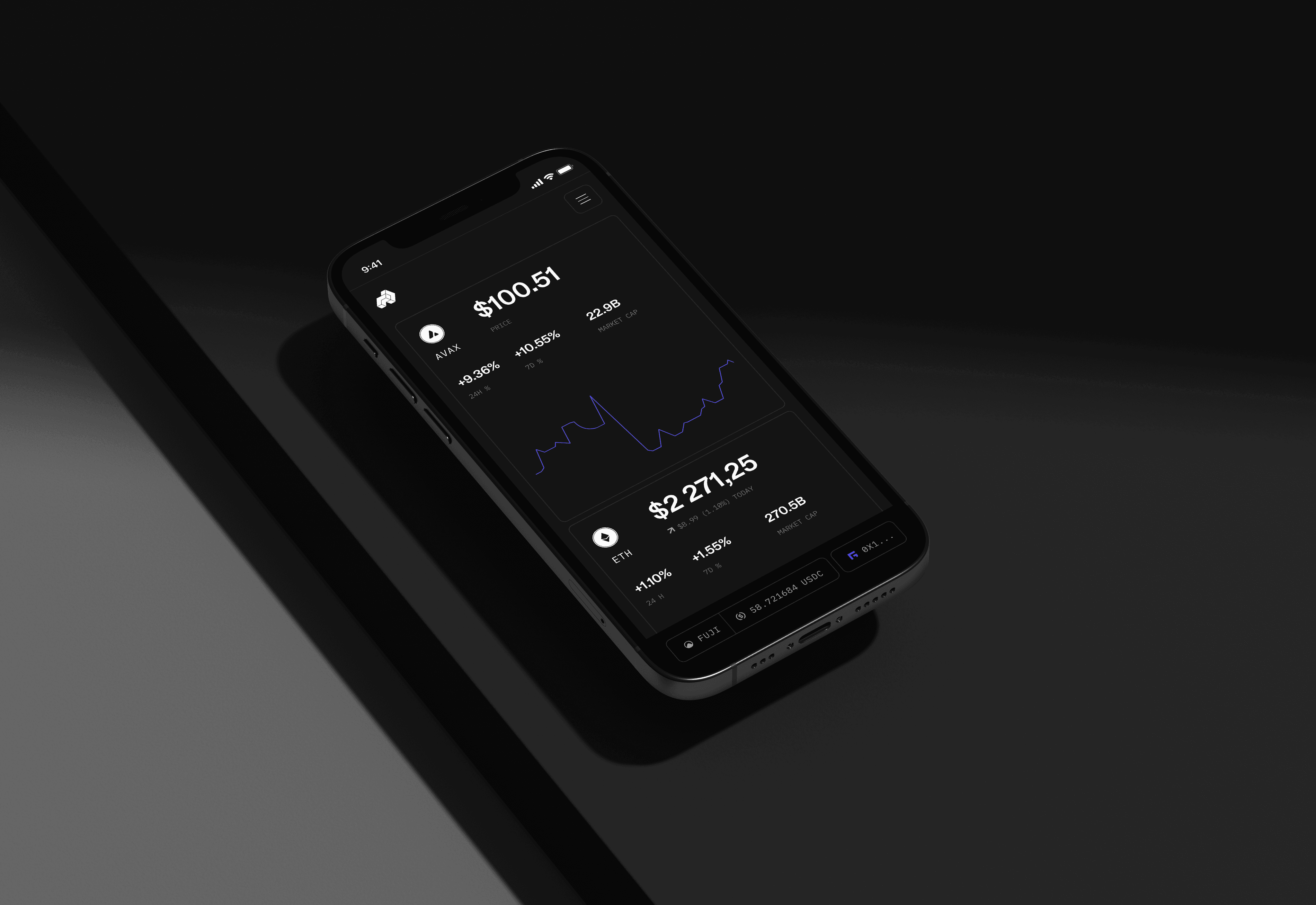
Themes
Themes
Themes
Over the years, we created both light and dark themes for the app, offering users more options. When Arrow launched on Berachain, we introduced a "honey" style, giving users a unique visual choice while staying true to the brand’s identity.
Over the years, we created both light and dark themes for the app, offering users more options. When Arrow launched on Berachain, we introduced a "honey" style, giving users a unique visual choice while staying true to the brand’s identity.


Growth & community
Growth & community
Growth & community
As the platform grew, so did the design. New features, community pages and partner integrations, including Berachain, were added without breaking visual consistency.
The system remained flexible while keeping the brand recognizable. Assets for Discord, Twitter and events supported Arrow’s presence beyond the product itself.