Vosbor
Vosbor
Design system, UI/UX design, Motion
Design system, UI/UX design, Motion
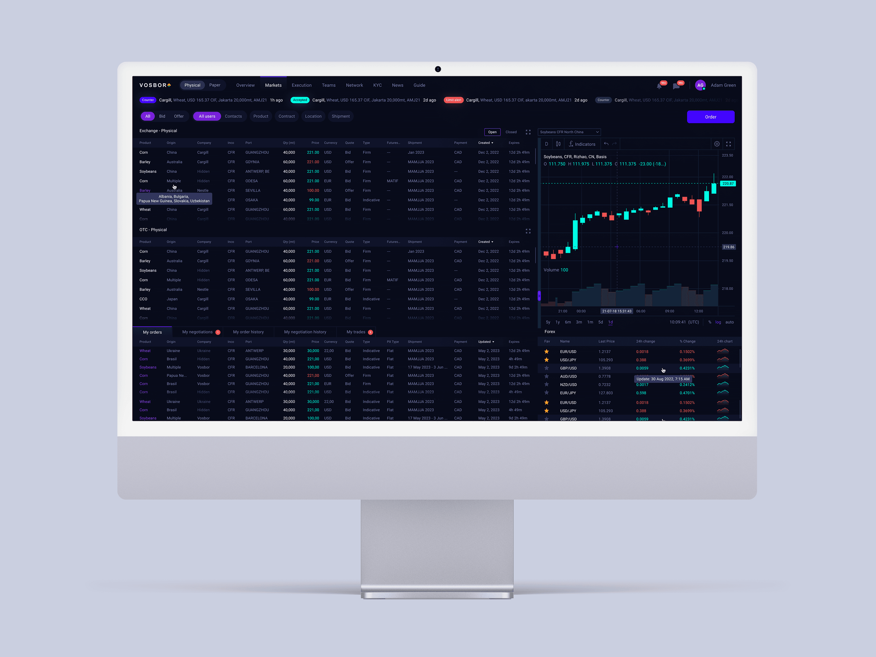
Vosbor connects buyers and sellers of agricultural commodities worldwide. The platform needed a modern interface that felt trustworthy and intuitive, even for users with limited digital experience.
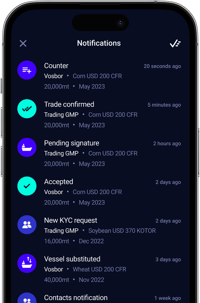
I was responsible for the overall product design. This included shaping the UX of complex trading flows, live bidding screens, responsive dashboards, and contract views. I worked closely with developers and product owners to ensure a smooth and accessible experience. I also ran regular user testing sessions to support design decisions and improve usability.
Vosbor connects buyers and sellers of agricultural commodities worldwide. The platform needed a modern interface that felt trustworthy and intuitive, even for users with limited digital experience.
I was responsible for the overall product design. This included shaping the UX of complex trading flows, live bidding screens, responsive dashboards, and contract views. I worked closely with developers and product owners to ensure a smooth and accessible experience. I also ran regular user testing sessions to support design decisions and improve usability.


Design System
Design System
Design System
Before restructuring, the Figma library had grown into a cluttered and fragmented space that slowed down the design and development process. Components were inconsistently named, screens were scattered, and the system lacked scalability.
The design system was rebuilt to bring clarity and order, components were relinked, naming conventions standardized, and layouts optimized to support three web screen sizes and mobile. This overhaul made collaboration smoother and significantly improved the team’s ability to scale the product.

