Arrow
Branding, Motion, UI & UX Design
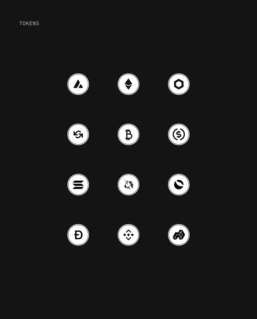
Arrow Markets is a decentralized platform focused on options trading. The Arrow Markets team approached us to create a unique brand identity that stood out from the typical, uninspired crypto design. They wanted figurative illustrations and a symbol reflecting their values. We created a futuristic, cinematic look centered around a minimal isometric logo — two white arrows floating in dark space. This concept evolved into a full visual system with geometric shapes like spheres, cubes, and cones.
I was responsible for Arrow’s visual identity, including logo, illustrations and motion design. I worked alongside another designer on the brand, UI and design system, ensuring a cohesive look and smooth user experience.
Water in Arrow Markets branding represents liquidity and movement within the static design of white shapes. This symbolizes the platform's high liquidity, with the deep purple color reinforcing trust and stability.
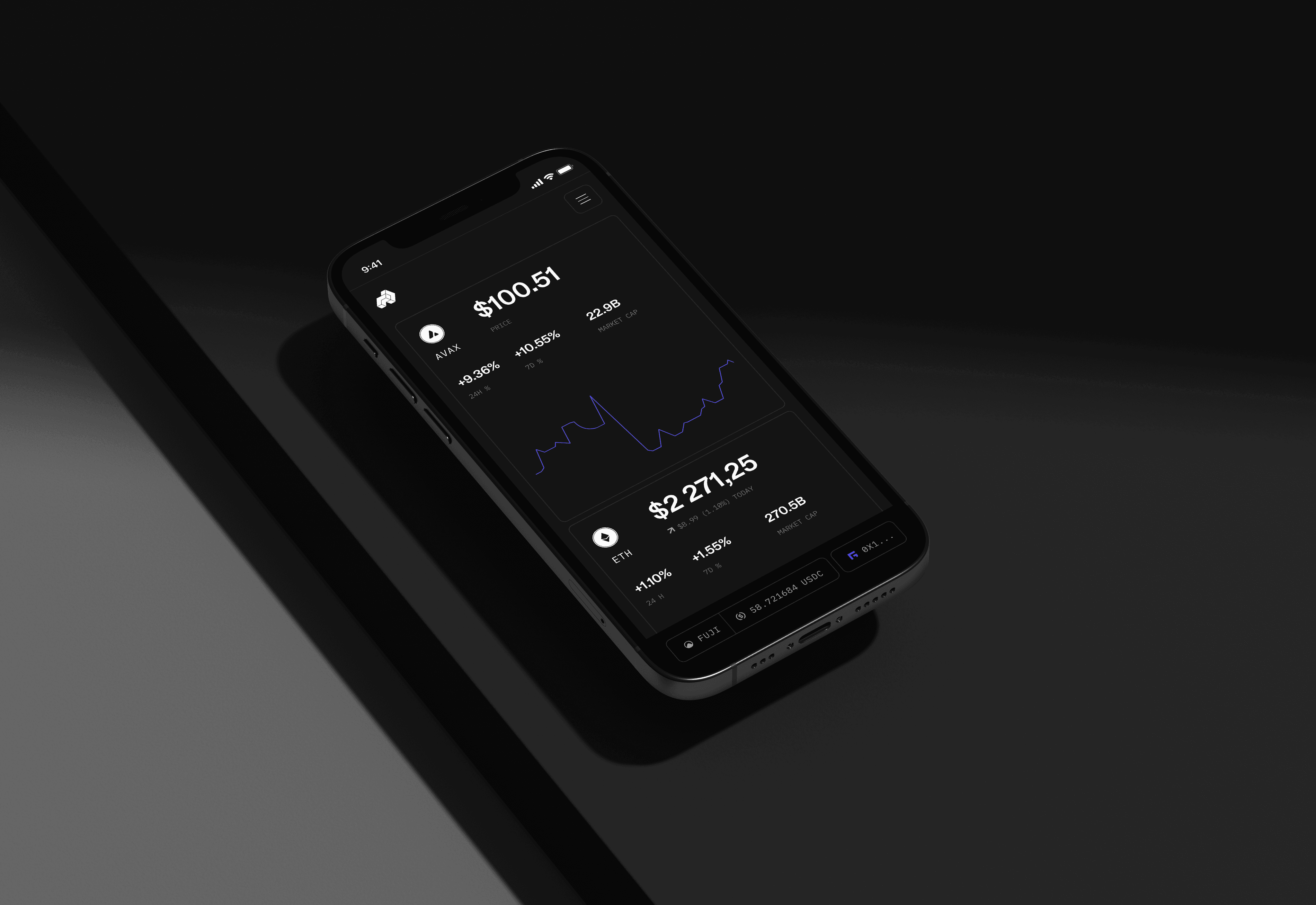
After the success of the branding, the client saw its potential and trusted us with the next challenge — designing a trading app. This allowed us to expand on the visual identity and create a seamless, cohesive user experience.
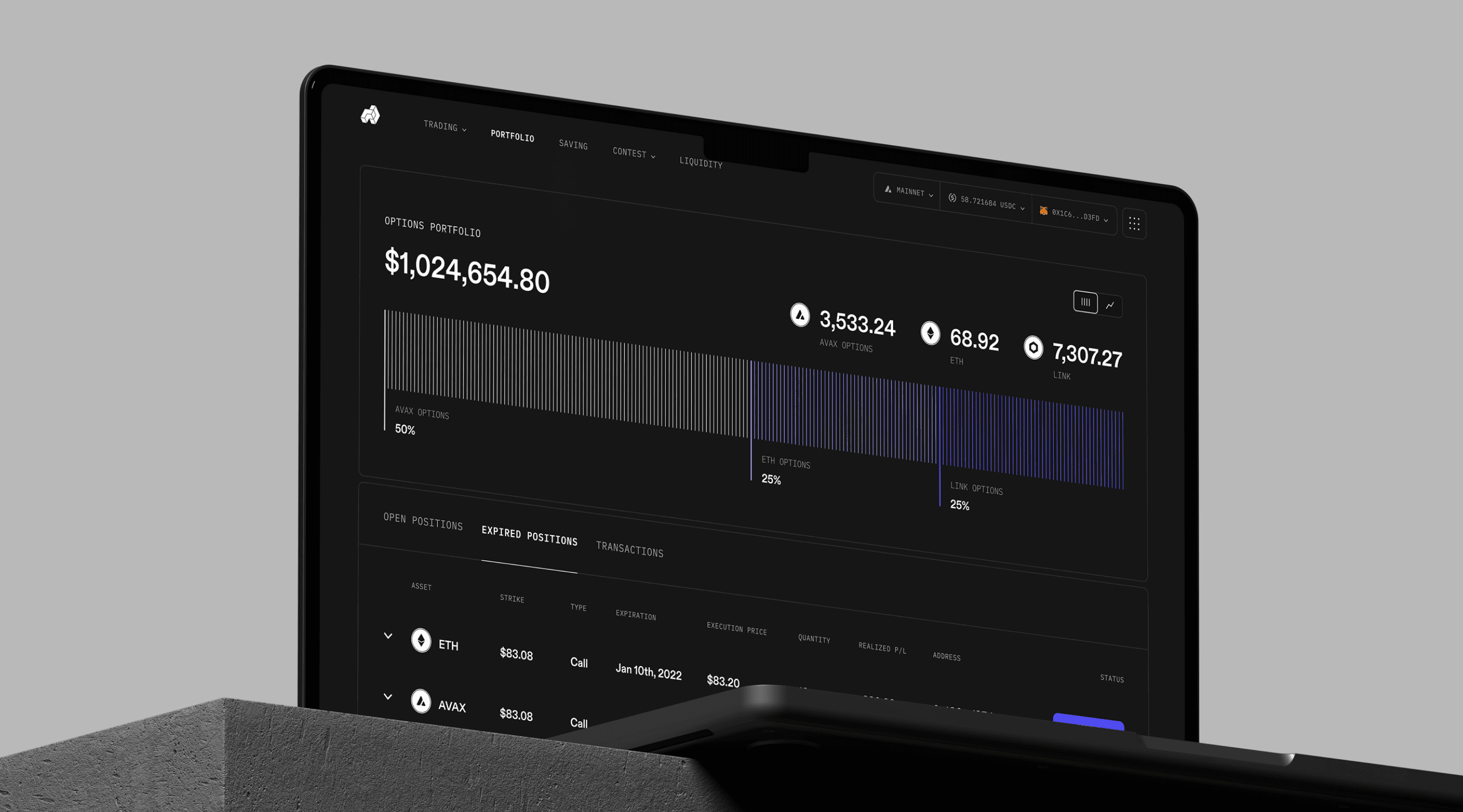


Over the years, we created both light and dark themes for the app, offering users more options. When Arrow launched on Berachain, we introduced a "honey" style, giving users a unique visual choice while staying true to the brand’s identity.


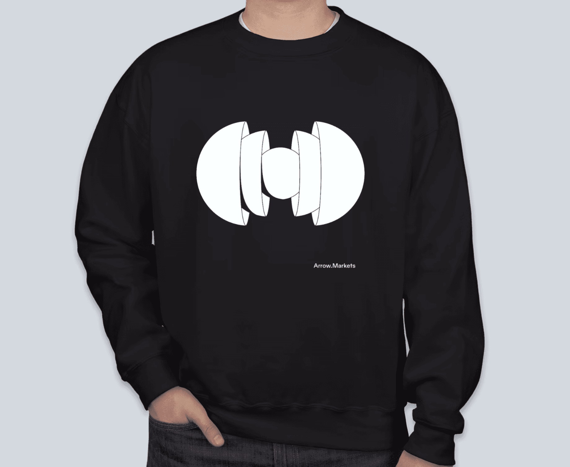
A key aspect of Arrow Markets was its community, so we focused on creating promotional content for social media, merchandise, NFTs, and more.

back to top